
Woman: The Brand

Watch a woman turn into a flawless magazine model with Photoshop – From Jezebel.com

Watch a woman turn into a flawless magazine model with Photoshop – From Jezebel.com
Like most men, I’m almost certain It’s never OK for a woman to admit that she knows she’s kind of average-looking and she’s OK with that. In the chaotic world of Advertising, nothing is more important for a woman stereotype than being perceived as beautiful. Not being perceived as a kind and generous person. Not being a smart or talented actress. Not being the quintessential professional. Not even being a decent mom.
Welcome to “Beautiful Woman 2.0” – The Brand.
Ask any professional advertising photographer, and I’ll bet you 9 times out of 10 they will tell you whatever the product being marketed, the “ideal” female form as described in the brief they are striving to capture is never the one in front of their camera. They work like dogs to capture an image of a fictional ghost, a phantasm only the fictional form of which ever exists. Photographs? They all need extensive “retouching” to “correct” the imperfections. It’s enough to give a photographer a complex. Why can’t I ever cast the right model? Some are closer than others, but always they seem flawed. Why can’t I ever get the “right” shot in camera? Why can’t any of my un-retouched attempts look as good as the magazine ads? Fantasy trumps reality always in the world of marketing.
It is enough to make a guy hate art directors, when in fact it is usually corporate marketing directives at work. Hidden agendas updated to the agencies pushing something “new” rather than simply acknowledging what already exists. Homogenize, rather than appreciate the differences in broad separations. Worse, it gives the general population worldwide the wrong idea about what constitutes beauty. Worse yet, it over influences young girls about what it takes to be “beautiful.” Psychologists say these heavily retouched false images and the ideals they establish for society as a whole greatly harm the self confidence and feelings of personal well being in young girls.
When did all of this craziness get started? How did these inherently wrong yet deeply ingrained cultural values get implanted? In other words, who came up with this wild idea in the first place? Hard to say, but this idea of creating an “impossible vision of beauty” has been around a long time, far longer than Adobe, who’s Photoshop often gets the blame. I found an interesting example in painting, proving once again that modern art is for better or worse, mostly modeled after earlier work.
A tip I use to better my photography: I frequently study the Master’s in the other arts. I particularly like the historical classic painters. The painters of their day were each the creators of their culture in their own times. I would contend that this painting was the
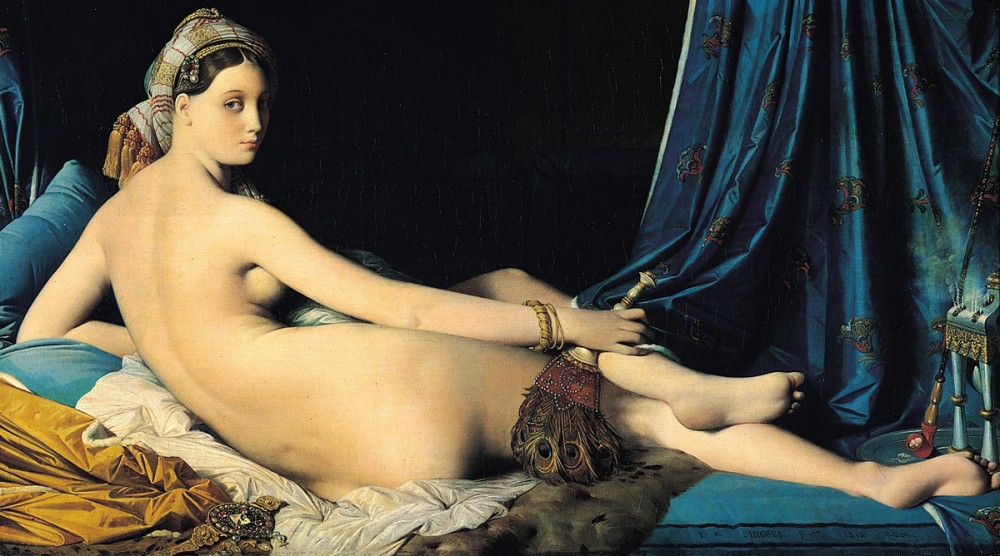
Jean-Auguste-Dominique Ingres, La Grande Odalisque, 1814, Oil on canvas, 36″ x 63″ (91 x 162 cm), (Musée du Louvre, Paris)
French Neoclassical painter Jean-Auguste-Dominique Ingres painted this painting in 1814, depicting an odalisque, or concubine, to reportedly “outraged hue and cry” for breaking the unspoken rules of art in his time. Breaking with strong tradition in the time of anatomical realism, Ingres Grande Odalisque attracted wide criticism when it was first shown. It has been especially noted for the elongated proportions and lack of – you guessed it – anatomical realism. I hereby nominate Jean-Auguste-Dominique Ingres for the Guiness Book of World Records as the oldest “Photoshopper” in history.
Wikipedia suggests:
“The painting was commissioned by Napoleon‘s sister, Queen Caroline Murat of Naples,[1] and finished in 1814. Ingres drew upon works such as Dresden Venus byGiorgione, and Titian‘s Venus of Urbino as inspiration for his reclining nude figure, though the actual pose of a reclining figure looking back over her shoulder is directly drawn from the 1809 Portrait of Madame Récamier by Jacques-Louis David.”
“Ingres portrays a concubine in languid pose as seen from behind with distorted proportions. The small head, elongated limbs, and cool color scheme all reveal influences fromMannerists such as Parmigianino,[2] whose Madonna with the Long Neck was also famous for anatomical distortion.”
“This eclectic mix of styles, combining classical form with Romantic themes, prompted harsh criticism when it was first shown in 1814. Critics viewed Ingres as a rebel against the contemporary style of form and content. When the painting was first shown in the Salon of 1819, one critic remarked that the work had “neither bones nor muscle, neither blood, nor life, nor relief, indeed nothing that constitutes imitation”.[3] This echoed the general view that Ingres had disregarded anatomical realism.[4] Ingres instead favored long lines to convey curvature and sensuality, as well as abundant, even light to tone down the volume.[4] Ingres continued to be criticized for his work until the mid-1820s.”[2]
Anatomy
Stemming from the initial criticism the painting received, the figure in Grande Odalisque is thought to be drawn with “two or three vertebrae too many.”[1][5] Critics at the time believed the elongations to be errors on the part of Ingres, but recent studies show the elongations to have been deliberate distortions.[6] Measurements taken on the proportions of real women showed that Ingres’s figure was drawn with a curvature of the spine and rotation of the pelvis impossible to replicate.[5] It also showed the left arm of the odalisque is shorter than the right. The study concluded that the figure was longer by five instead of two or three vertebrae and that the excess affected the lengths of the pelvis and lower back instead of merely the lumbar region.[5]
Another interpretation of this painting suggests that since the duty of some concubines was merely to satisfy the carnal pleasures of the sultan, this elongation of her pelvic area may have been a symbolic distortion by Ingres. While this may represent sensuous feminine beauty, her gaze, on the other hand, has been said to “[reflect] a complex psychological make-up” or “[betray] no feeling”. In addition, the distance between her gaze and her pelvic region may be a physical representation of the depth of thought and complex emotions of a woman’s thoughts and feelings.[5]
PLEASE RATE THIS STORY! [ratings]


